AAA Auto Claims
Reimagining AAA’s claims experience
AAA Auto Claims
Overview
AAA has made it a priority to provide a superior claims experience to its customers. However, it is somewhat lagging in the area of digital communication when it comes to updating customers on the status of their claims and the subsequent steps involved in filing an online claim.
In order to address this issue, AAA is committed to improving its digital communication channels and ensuring that customers receive prompt, accurate, and comprehensive updates on their claims status.
This project was necessary to present to upper management, highlight online claims value, and secure a budget for implementation.
Role: Lead UX Designer
Company: Clublabs- AAA (Automobile Club of Southern California)
Timeline: 3 Weeks
Team: Product managers, UX researcher
What’s the problem?
After filing a claim online, AAA's customers are struggling due to a lack of digital updates.
Customers are uncertain and confused after filing a claim, unsure of what to do next.
As a result, there is a surge in calls to customer representatives.
What’s the goal?
To create an ideal online auto claims experience to improve:
Claims satisfaction
Reduce call volume
Close the competitive gap
Provide insured self-serve options online
Increase online claims penetration
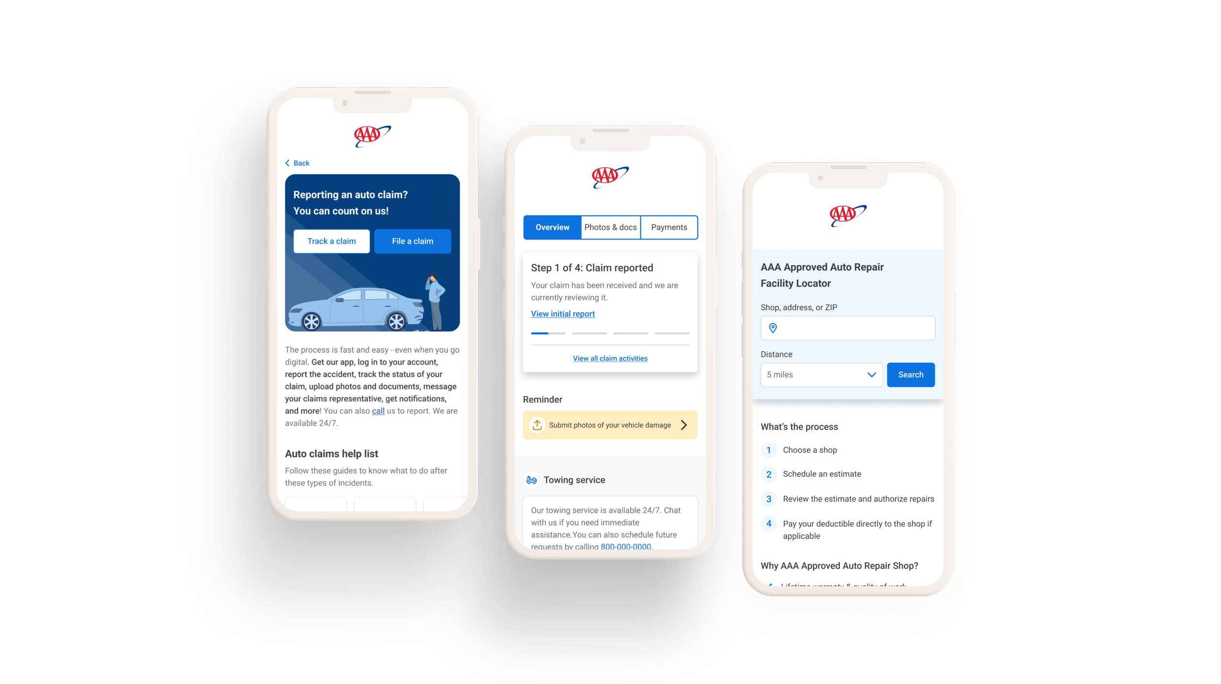
What’s the solution?
Communicating early & providing clear next steps
Adding a number to the steps will guide users on what they need to accomplish first, which is submitting the photos first. The faster we get the photos, the less fraud might happen.
Motivating the customers to choose a member-preferred shop
As for the business, it’s better to use a preferred shop - listing the benefits of selecting an MPR shop motivates the user to choose an MPR shop. However, we still give the customers control to select a non-MPR shop.
Improving the repair shop scheduler
AAA has an outdated repair shop scheduler; however, it’s buried and hard to navigate. We enhanced the user interface for a better experience and made it accessible by adding this to the claims screens.
Visibility of the claim status
Adding on top a clear message on the claim status, and an overlay page to see the detailed progress of the vehicle repair and overall claim status.
Reminder
Introducing a reminder feature for users to finish incomplete tasks, which will expedite the claims process for both agent and claimant.
Chat feature
Messaging is proposed to allow users to respond to customer service representatives via the mobile app, leveraging push notifications and encouraging app downloads.
Discovery
How did we start?
Shadowed and interviewed an auto claim representative
We want to provide a more self-serve functionality for members to view claims summary and status after they have filed a claim. And the first thing we did was to shadow a claims representative.
This is to understand the claimant’s journey in the claims process and find any gaps. Also, to incorporate feedback from the claims team to develop our strategy, and better understand claimant needs.
Findings:
Agents find Hi-Marley, a text messaging platform when communicating with claimants. Text messages are more convenient and they can send attachments through this platform.
Initial damage photos are the best kind of documentation. It helps in the investigation process.
Agents manually send the 5 closest preferred repair shops near the customer’s address and send it via Hi-Marley. If they prefer other body shops, the adjuster still needs to know the info of the body shop to get details from them.
Claimants often call back (some incessantly) to get status updates.
People do not know what the next steps are after filing (either because it’s their first accident or different situation than accidents they’ve been in before).
People do not know what the next steps are after filing (either because it’s their first accident or different situation than accidents they’ve been in before).
Usually agents have to explain rental car coverage & uninsured/underinsured collision most often.
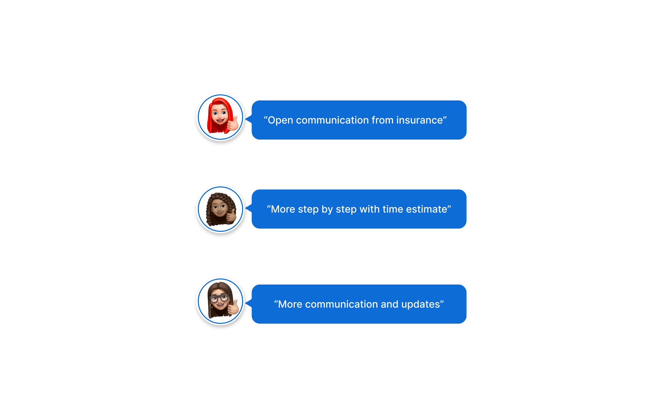
Survey with claimants
Together with the help of our UX researcher, we did a survey to understand the needs, pain points and suggestions of users who filed a claim before.
Participants responses:
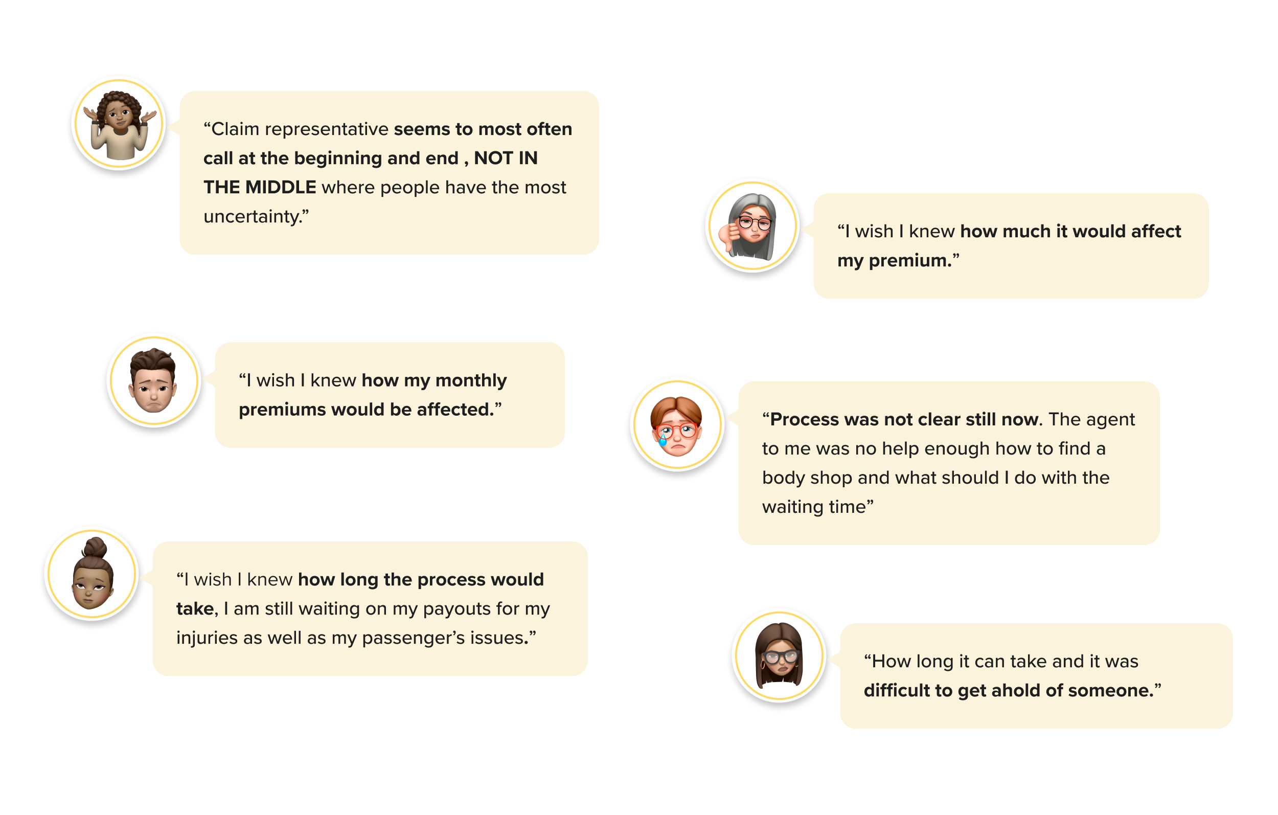
Participants suggestions:
J.D. Power Claims Study
J.D. Power is a global leader in consumer insights, advisory services and data and analytics. According to the J.D Power claims study:
Digital status updates significantly boost satisfaction
Opportunities to improve communication to make insured feel at ease after submitting a claim, explain the claim process and be clear about next steps
Competitive Analysis
Competitive analysis was a bit difficult since these kind of flows can not be easily obtained. Fortunately, one of our coworkers who is insured in a different company documented the steps she took when she had to submit an auto claim online. I also have to reach out to my coworkers if they have an open claim and to take some screenshots for me. There are also some artifacts given to me that I can use for research.
I gathered screenshots of direct competitors on what they are doing best and why it is important to have on the ideal claims project.
Findings:
Adding what’s next section right after filing a claim- Communicate clearly to users the next step they should take after filing a claim. This will speed up the process and motivate the user to take an action.
Visibility of the claim status - keep the users informed of what’s going on with their claim and vehicle status.
To-do list - this will help to motivate the user to complete any follow-up tasks. A notification on what they need to accomplish so their claim will have progress.
Claim representative info should always be accessible - It should be easy to search and recognizable so they can contact their representative easily whenever they need immediate help.
Control on the different communication channels - giving the user the preference and control on how they would like to receive updates.
Good grouping for the FAQ - grouping the same topics together makes it easier to scan for the question and answer.
Communication tool on the app itself - A messaging feature through the app, this will encourage user to return to the app as well.
Claim process and how it works - this will help the user understand the process and how it works.
Key Takeaways
According to JD Power claims study:
digital status updates significantly boost satisfaction
opportunities to improve communication to make insured feel at ease after submitting a claim, explain the claim process and be clear about next steps
Claimants are calling their adjusters to get claim updates and check the status of their claim
Competitors offer a robust online and mobile app claims experience
Insureds want information about the claims process, estimated costs of repairs, duration and how premiums may be affected
Ideation
User Flow
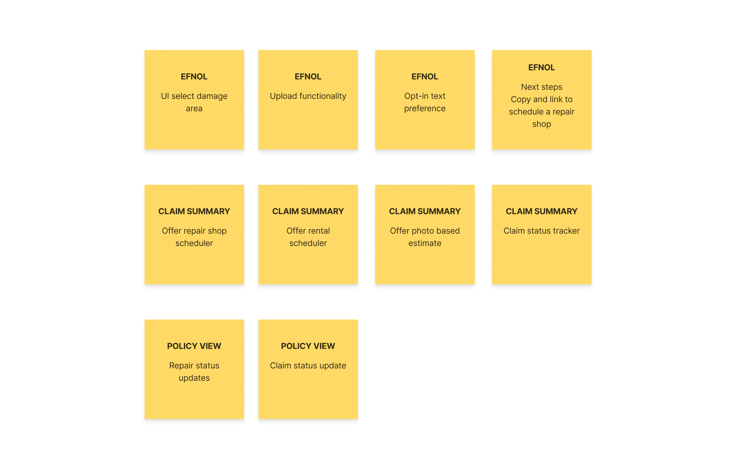
I made a draft flow to fully focus on the flow. With this process, we learned what screens are needed; more questions were raised since most of us were unfamiliar with the detailed journey. Through this process, I gained a comprehensive understanding of the screens needed. It turned out that many screens were required, and we needed to chunk this out and present the most valuable first.
New Features
During our working session, consisting of product managers and a UX researcher, I presented the initial flow, and we identified areas where we could improve and the additional features we needed to add. Due to a tight deadline, we prioritized the best screens to showcase while keeping customer satisfaction our top priority.
Claims Customer Journey
I created an infographics of the customer journey to help leaders understand the ideal claims process more easily. I also highlighted the communication points since this is where we are lacking currently.
Explorations and Iterations
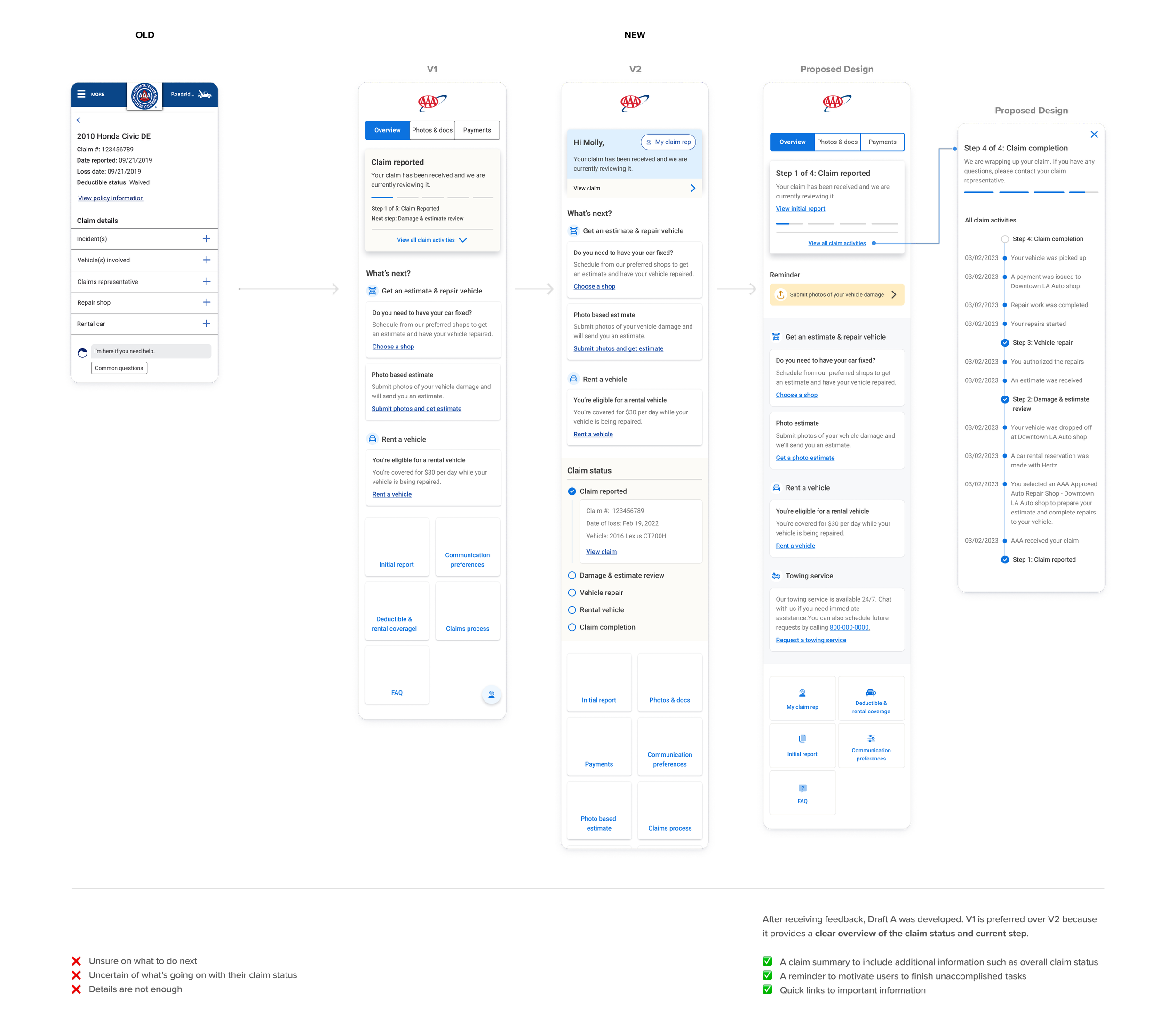
eFNOL Confirmation Page
We want to make an improvement of the current confirmation page to guide users on what they need to do next. This is a crucial part since, currently, this is where the claimant has to wait for a call or text from the agent, or the claimant has to call to follow up. This creates a significant level of uncertainty for our customers, which we aim to eliminate through this enhancement.
Open Claim Page
We want to enhance the open claim page since this is also critical for the customers. We want to ensure they know what’s happening to the claim in every progress. In this case, we want to ensure they are well aware of the process and can do self-service options. This way, it will be faster and more convenient.
Results
This ideal claims project was a huge success, leading to securing a budget and adding the proposed improvements and new features to the roadmap. We have subsequently divided the project into phases to ensure it can be effectively and efficiently executed.
Takeaways
I found this project to be both challenging and exciting, as it required a great deal of research and provided significant value to users and the business. While I have not seen it fully developed and implemented, I believe it is an excellent starting point, and we are well-positioned to move forward.
Here are some of my takeaways:
The project taught me an important lesson - even with limited time, I need to follow a proper design process to support my design decisions. I gathered all the necessary artifacts and conducted a thorough competitive analysis to stay ahead of the competition. I stayed curious and asked silly questions. One of the biggest challenges I faced was working on a product that I was not familiar with and had a limited timeframe. To overcome this, I proactively sought out subject matter experts like claims representatives to understand the customer journey better. Additionally, with the collective effort of the whole team, we continuously updated the design based on new information, requirements, and feedback, which ultimately led to the project's success. If I had more time, I would have dedicated more effort in making more options and to the visuals to make it more appealing.